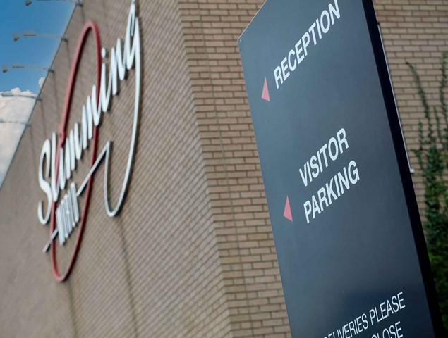
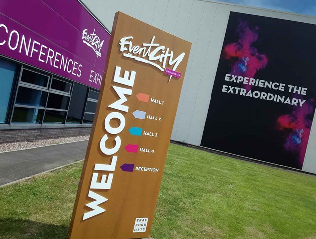
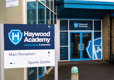
Wayfinding and directional signage is vital for the navigation of your premises, but because of their tendency to be a need rather than a want, it can sometimes feel like there isn’t much choice in the way of design and style… We’re here to tell you otherwise!
A report from Fedex states 68% of respondents believe a store's signage is reflective of the quality of products or its services, this is further reinforced by the same report suggesting 52% of people surveyed can be put off entering a premises by poor quality signage. So, if you use directional signage for visitors to find you, make sure your signage looks good, is clear and easy to follow.
To enhance your wayfinding and directional signage, utilise your creative freedom to show off your organisation's personality to capture the attention of your visitors. We’ve outlined some ways in which you can be more creative with the style of your signage and bring your brand to life.
First Impressions Count
Your directional signage may be one of the first hints of your branding that visitors/staff see when they approach or enter your premises so it’s important to make a good first impression.
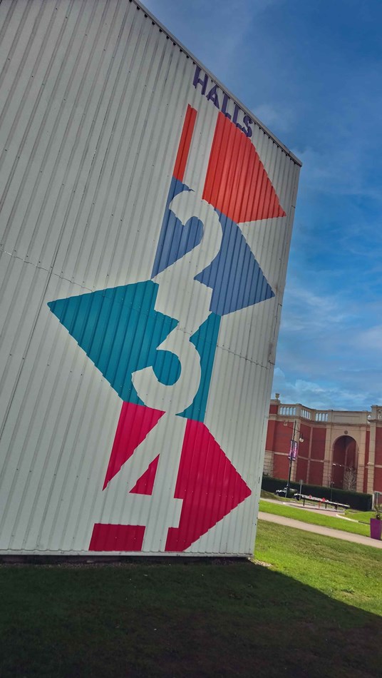
When considering signage within your premises for both staff and visitors, incorporating fun branding that references the company's locations or history can create engaging conversation starters throughout the premises.
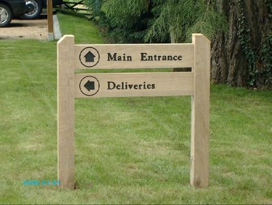
If the primary audience for your signage is customers, it's important to design signs that make them feel comfortable and at ease while navigating your space.

Think carefully about the atmosphere you want to create and how your signage can contribute to a welcoming environment.
Materials Matter
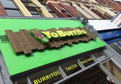
The type of material you choose for your sign can make a big impact on the overall look of your sign, whether you want it to blend into the surroundings or stand out and make an impact.

For instance, in a zoo, opting for animal shaped icons to help guide your visitors can be a fun alternative to just using text.
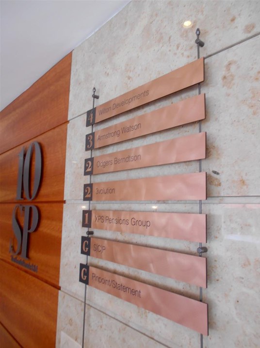
Alternatively, in a museum setting, signs that blend in with the surroundings, such as those with a brick background and bold font against a brick wall, would work better with the immersive experience.
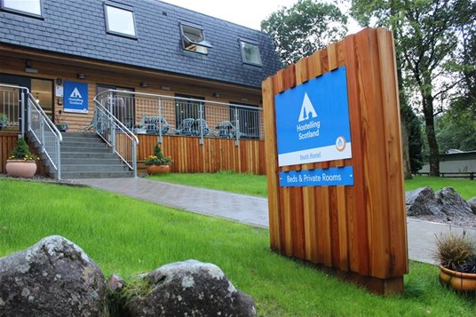
Whether your sign is situated indoors (wayfinding) or outdoors (directional) will depend on the material we advise to use to ensure It stands the test of time.
Illumination & Interaction
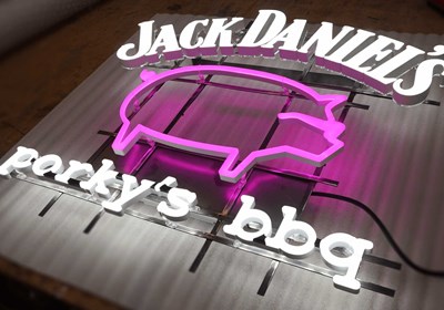
Illuminated and digital signage is a great way to enhance the wayfinding and directional signage within your premises.
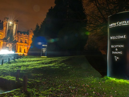
Whether it’s nighttime, or you just want to elevate your establishment there are plenty of ways to incorporate illumination into your branding and the type of building you operate in.
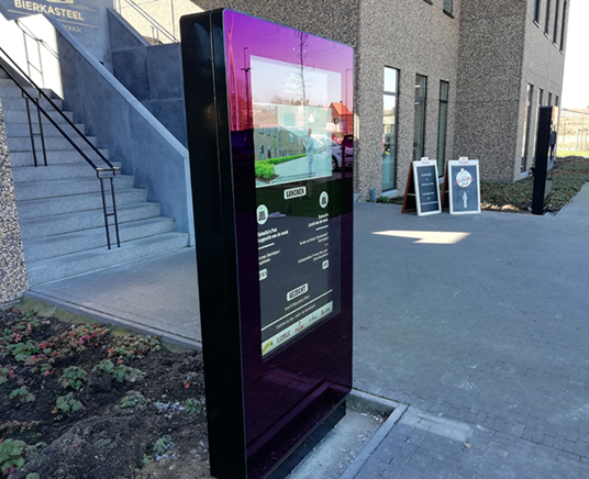
Digital Signage is a great option when you want to personalise your wayfinding and directional signage depending on the visitor.
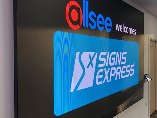
For example if you have multiple meetings occurring concurrently and want to ensure your visitors feel at ease when navigating your building, by using digital signage, you have an endless number of options stylistically through colour, movement and fonts to make it engaging.

