The UK retail market has changed irreversibly in recent years. We can now source everything from food to frocks via a myriad of online channels. E-commerce is evolving and growing rapidly in popularity too with 30.7% of the nation’s total retail sales taking place via the internet in November 2023 – growth of 9.6% in just five years.
Naturally, businesses want to leverage online buying habits to boost their revenue in the digital age. We only need to look at household retailers heading to TikTok to showcase their personality and promote purchase. But for a lot of brands looking to grow, it’s worth going back to basics to capitalise on the thousands of people potentially passing their business every day – you guessed it – by upgrading their signage.
Don’t just take our word for it though. Some of the UK’s biggest retailers are continuing to back their bricks-and-mortar by doing just that. Superdrug opened 25 new stores in 2023, and refitted 70 stores with new shop fronts, fully recyclable signage, and upgraded fascia and internal signage. What’s more, as of February 2024, Poundland is about to embark on a major makeover of 150 stores nationwide which will include a complete overhaul of their shop signage.
In a survey by Custom Neon, 72.2% of respondents said they believe that good signage is more important for a business than social media or newspaper advertisements. Read on to find out exactly why signage is still an indispensable marketing tool for your business.
HELP PEOPLE FIND YOU
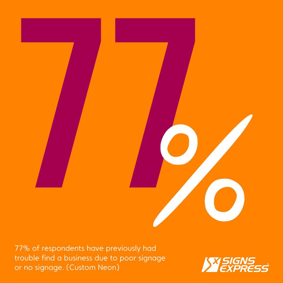
A report by Custom Neon found that 77% of respondents - almost 4 out of 5 - have previously had trouble finding a business due to poor signage or no signage.
The main way outdoor signs influence the behaviour of customers is by first of all letting them know you’re there! What’s more, as interesting US based study found that 85% of your customers likely live or work within a five-mile radius of your business (signs.org), so ensuring they can find you is key to getting them to buy from you.
Our recommendations
Make it instantly recognisable
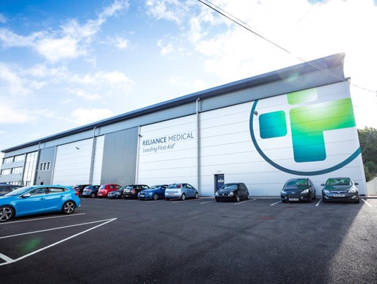
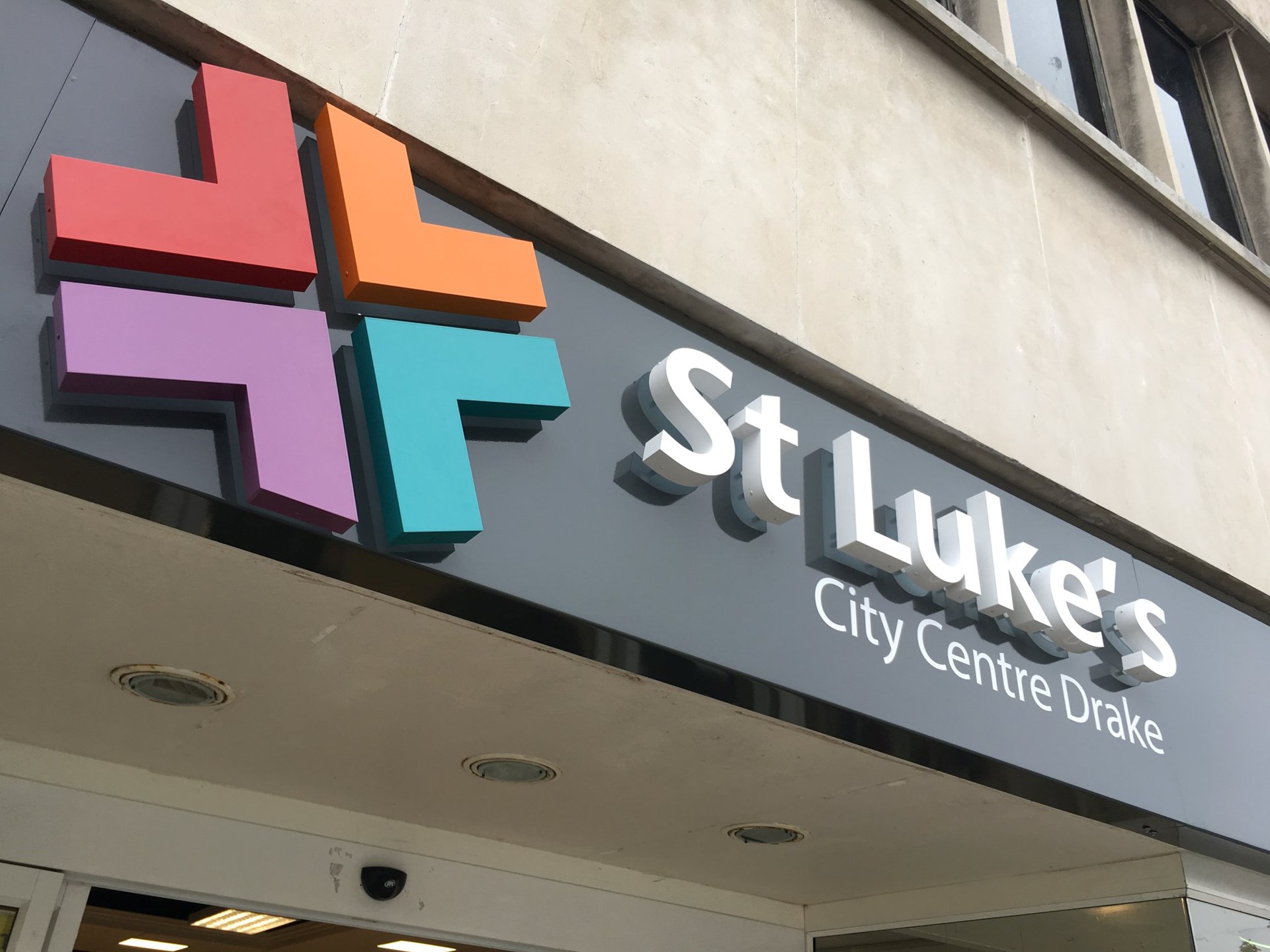
When it comes to your outdoor signage design, make sure it’s the perfect embodiment of your brand, including your logo, brand colours, and a clear representation of what you offer. You also want to stand out – try choosing complementary or contrasting colours and text styles that make you stand out from the competition and your surroundings.
In the UK where the weather and light change dramatically from season to season, it’s ideal to illuminate your outdoor business signs where possible. Lighting your sign will ensure customers can locate your business in the day, at night and in all weather conditions, and let them know when you’re open for business.
Go big and/or bold

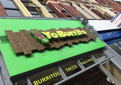
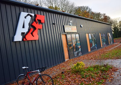
The bigger and bolder your sign, the more likely it is to catch the eye and alert passersby to your presence. If like many businesses, the size of your sign is limited by space or planning restrictions, you’ll want to strategically analyse the placement of your sign to ensure it achieves the highest exposure possible among the hundreds if not thousands of people walking or driving by your business every day. Perfect for retail and industrial parks, monoliths and totem signs are great for catching the eye of drivers passing your business as they can be seen from long distances.
Focus on the customer journey
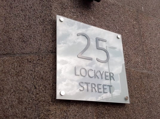
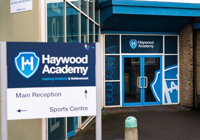
Directional and wayfinding signage is one of the best ways to both guide people to your business and can influence customer behaviour in several ways. First, they can help them locate your business from outside your site or premises, then provide them with a seamless journey to enhance their overall customer experience, and ultimately, make it more likely they’ll purchase from you. This includes signs towards reception, toilets, car park and any other areas they need to access within your business.
If you want to find out more about the benefits of wayfinding and directional signage, read our complete guide and explore our wide range of solutions below.
GET PASSERSBY TO ENTER
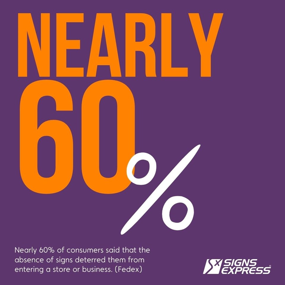
Now your customers know where you are and how to find you, onto Phase 2 – getting them inside! Research from the US found nearly 60% of consumers said that the absence of signs deters them from entering a store or business (FedEx), so this is all about showing why they need to explore what’s inside!
Our recommendations
Don't rush it!
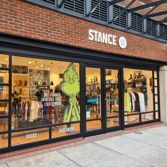
According to a survey conducted by FedEx, 68% of consumers believe a store’s signage is reflective of the quality of its products or services. Your outdoor signs are a direct representation of the quality of your offering. It’s a snapshot of what’s inside, so you want to spend time on the design and materials selection to make sure it’s:
- Made with high-quality materials
- Has a modern look and feel or one aligned closely with your brand aesthetic
- Is smart and consistent across your premises
- Provides necessary and useful information customers will look for, such as contact details and street address.
Invoke positive emotions

The language you place on your sign can tell customers a lot about your business. Focus on using messages to create welcoming signage for your customers, or better yet, make them smile! It’s a split-second decision about whether to enter your business, but people are more likely to if their first encounter sparked a positive emotion. This can also be achieved by using your outdoor business signs as decoration, creating stunning displays or with lifestyle imagery your customers aspire to.
Encourage exploration

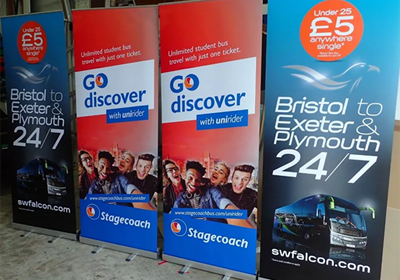
Your outdoor business signage is the very beginning of your customers’ journey with your business. That means it’s a valuable opportunity to encourage passersby to step inside and explore what you have on offer. This could be by creating a story with your external signage, through pictures, words, or graphics. Or by teasing them with examples of products and experiences they will find inside. A great way to do this is with an impactful advertising campaign, displayed as banners or by digital screens. It could also take the form of a map detailing the contents of your premises.
PERSUADE VISITORS TO PURCHASE
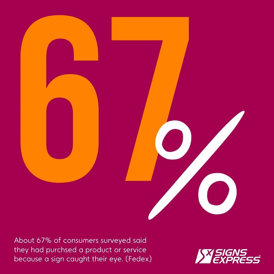
About 67% of the consumers surveyed said they had purchased a product or service because a sign caught their eye. (FedEx). Your outdoor signage is a powerful marketing tool that acts as a 24/7 advertisement that often offers a huge return on investment (ROI).
Our recommendations
Clearly display promotions and offers
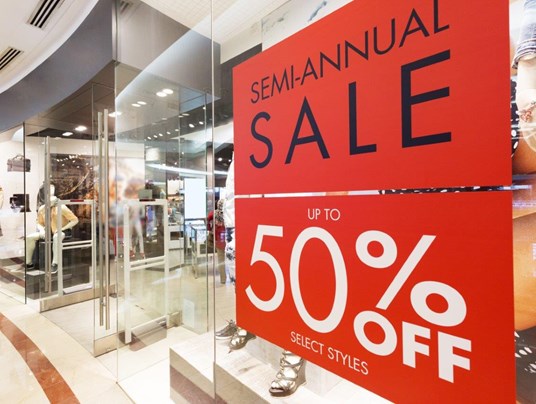
There’s nothing like an unmissable deal to create unplanned purchases. Don’t let yours go unnoticed – and instead use it to call passersby inside. This can be achieved with a wide range of promotional signage solutions that we offer, from temporary soft signage solutions such as banners and flags, to A-boards and swinger signs which can be changed as often as you require.
Don’t set and forget

Staying current is vital to showing customers the value of your products and services while staying relevant and differentiated from your competitors. So, if you’ve got a fading fascia or a dowdy display going on, consider this your sign to refresh!
Make it easy
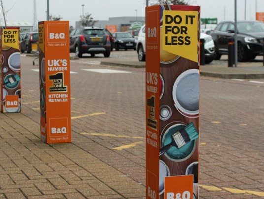
Great exterior business signs are about making it easy for your customers to achieve their desired outcome or experience. This also means making it easy for your customers to stay in touch with your business and purchase later via an online channel or by returning to the store. Your signage can complement your online marketing efforts, so ensure all relevant contact details are clear and visible across your exterior signage – from your social media handles, to your website and phone number – this is easily achieved with window graphics, for example. Also, signs can make it easier for customers to recognise why your product is the one they need – by providing much of the crucial information they need about your products before they purchase.
CREATE NEW CUSTOMERS
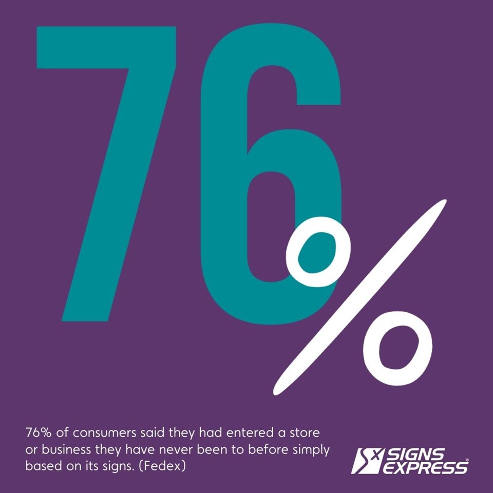
76% of consumers said they had entered a store or business they have never been to before based simply on its signs (FedEx).
People unfamiliar with a brand will make snap decisions about whether to enter your business and whether to buy something. So, it’s vital to consider colour psychology and typography to stand out to your target audience and spark specific emotions and resonate with what they’re looking for.
Our recommendations
First impressions count
The split second a potential customer sees and assesses your signage is the time you have to tell offer what they need. You can do this by leveraging colour psychology, which can register in the minds of passersby even before they see your name and logo. Ensure you choose colours appropriate for your field or industry, for example blue is often associated with feelings of calm and well-being and is used for many healthcare brands.
Other colour associations include:
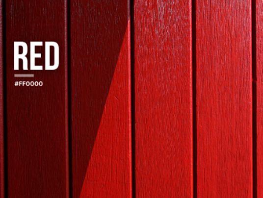
Dynamic, passionate, strong, and courageous – used even sparingly, red can energize your signage and graphics and catch the eye of your customers. Try using it for your call to action or contact details. Associated industries: food, automotive, courier services.
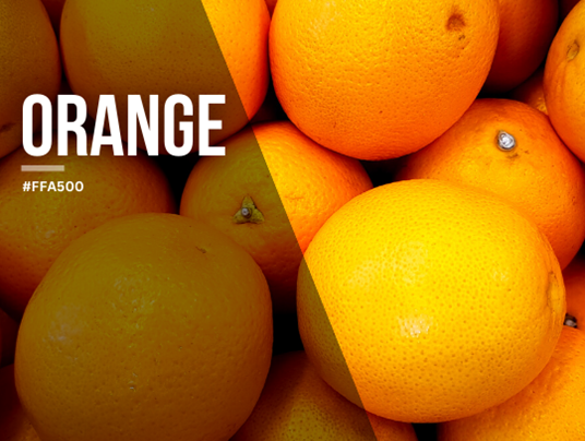
The colour of optimism, exploration, encouragement, and self-confidence. Orange combines the energy of red with the cheerfulness of yellow. Rejuvenate your signage and graphics by highlighting key details with orange. Associated industries: aerospace, engineering, entertainment.
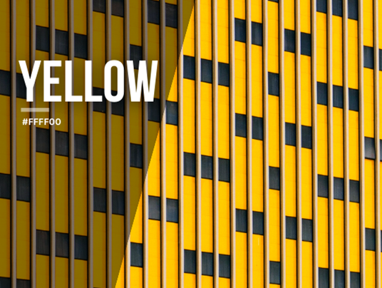
Uplift your spaces with yellow – the colour of happiness, hope, playfulness, and creativity. Let your customers know you’ve got a new way of doing things and brighten their outlook by using this warm colour within your exterior signage and graphics. It’s also associated with frugality and getting a bargain. Associated industries include fast food and food brands.

While darker greens reflect wealth and prestige, lighter hues evoke growth, the natural world, and freshness. Use within your signage and graphics if you’re wanting to project a prestigious or environmentally friendly perspective and build trust in your brand. Associated industries include healthcare, real estate, and sustainability.

Looking to create a sense of calm and clarity? Why not add teal to your outdoor signage, as it’s often associated with open communication, logic, and serenity. Associated industries include electronics, sports, and communications.

The colour of trust, calm, wisdom, and peace; using blue in your signage and graphics can help you evoke these emotions with your brand. You’ll show yourself as dependable, which is why it’s often chosen by insurance, financial and healthcare businesses. Choose the intensity of your blue accordingly – from the mature shades of navy to lighter, pastel sky-blue hues. Associated industries include healthcare, professional services, social media, technology, and healthcare.

With historical roots in royalty and luxury, violet can be used to signify elegance and femininity. With these subconscious associations, using violet in your signage and graphics means your brand can embody all the above. Associated industries include products aimed at women and girls, technology, and logistics.
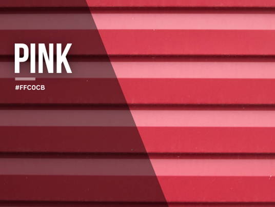
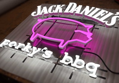
Used in hot, bright tones, pink speaks to youth and urgency. Used in dusky, pastels hues, it can be used as a calming contrast. Although once considered a masculine colour, it is now often a signifier of love and femininity. Associated industries include women’s fashion and cosmetics.
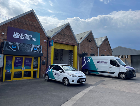
Still not sure which colour(s) could best encapsulate your brand with your exterior signage? We offer expert signage consultation and design services in your local area, so why not chat things through with your local Signs Express team using our centre finder.
GENERATE WORD OF MOUTH MARKETING
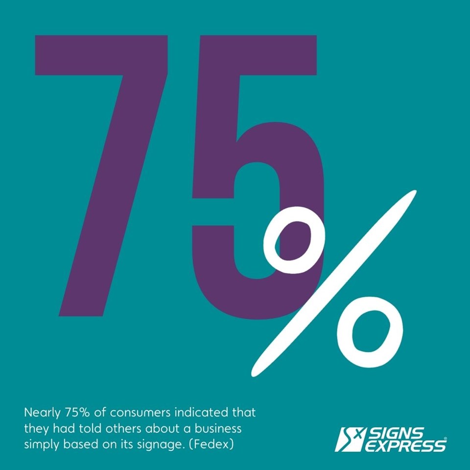
Last but most definitely not least – we’ve kept this gem until the end! In FedEx’s survey, nearly 75% of respondents indicated that they had told others about a business simply based on its signage. (FedEx). That’s right – signage is instrumental in driving the most powerful form of marketing there is: recommendations and word of mouth. On the flipside, a report by tensator.com suggest 66% of respondents have had a poor opinion of a business because of its signage.
Our recommendations
Create a unique and interactive experience
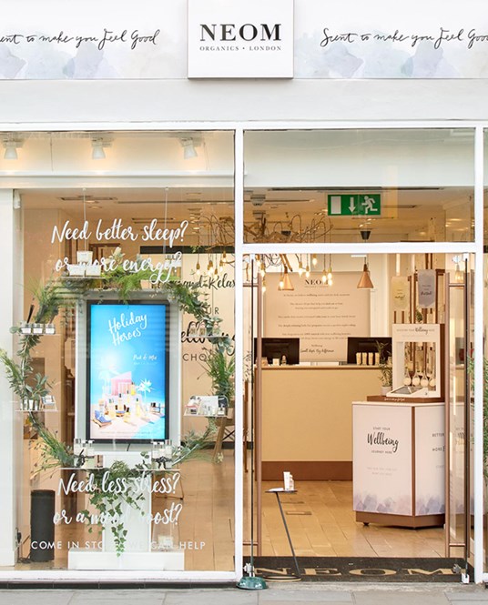
In this competitive retail landscape, consumers are looking for personalised and unique experiences that differ from the everyday. Your signage is more than it seems – and can be a gateway to memorable experiences to increase loyalty and love for your business.
Digital signs with touchscreen capabilities displayed just by your entrance can provide bespoke experiences for all types of retail stores. If you’re feeling extra innovative, using signage as a starting point for an augmented reality experience will really make your brand stand out.
Digital signage is also the perfect stage to push the limits and show an unexpected side to your brand to get people talking. You can also change the content of these signs remotely, so you have full control over what’s showing and when.
Make customers laugh

A good giggle is a great way to break into the coveted land of word-of-mouth marketing. Customers will want to share the laughter with their friends and family, making it more likely for them to capture and share your hilarious signage on social media – broadening your exposure with potential future customers. Most important here is your idea, which we can then apply to any one of our promotional signage products, including banners.
Integrate your signs and online strategy

Integrating your signage to work seamlessly with your online strategy is a must for businesses looking to grow. This could include via QR codes displayed outside your business that display your products and services, or menu if you’re a restaurant or café. It could also be used to publicise online giveaways and competitions, helping to send people over to your social media and website, increasing your exposure and potential for further purchases, adding another layer of marketing potential to your signage.
Get in Touch
Enquiry Form
Please contact your local centre by completing this enquiry form and we shall respond to your request as soon as possible.
